Tab 标签页
例子#
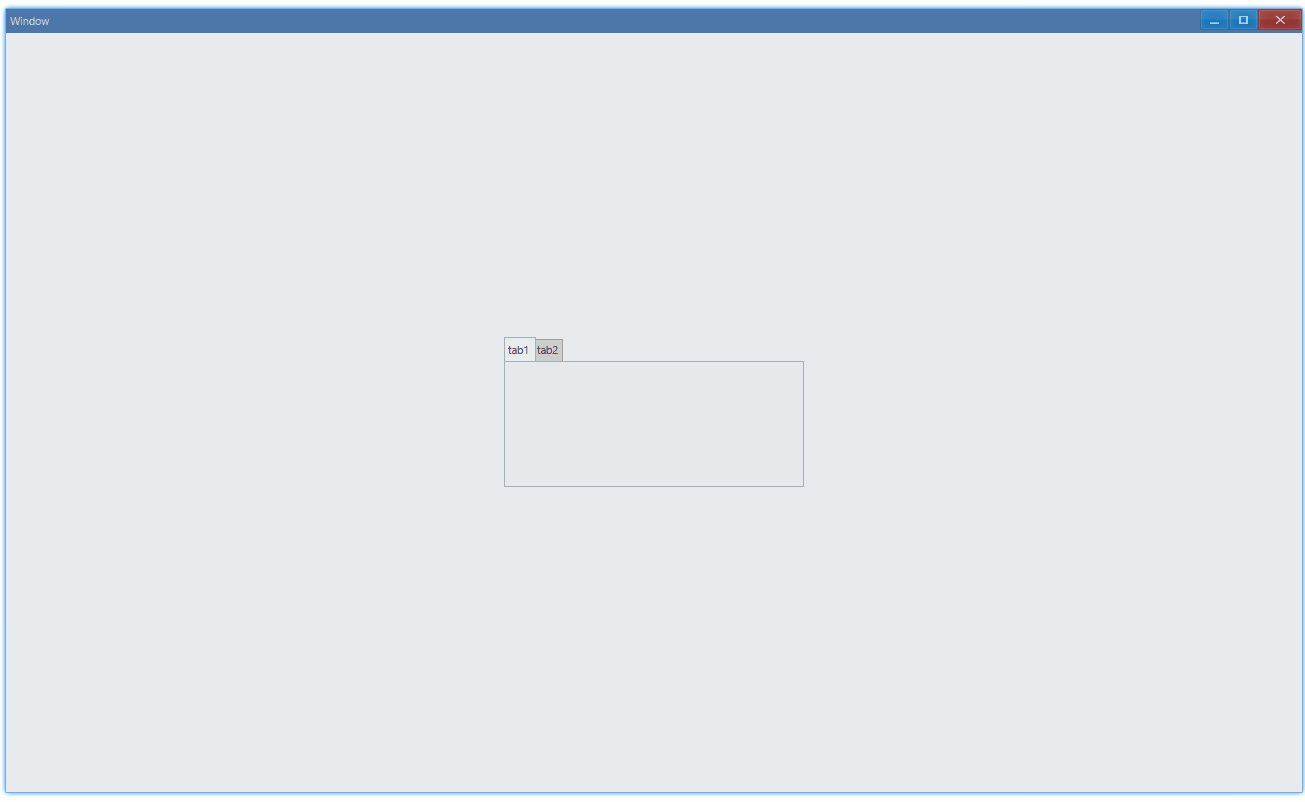
基本用法#
export function App() { return ( <Window> <DemoLayout width="300dpx" height="150dpx"> <Tab items={[ { id: 1, name: 'tab1' }, { id: 2, name: 'tab2' }, ]} ></Tab> </DemoLayout> </Window> );}在这个例子中,我们演示了标签页的基本用法:在 tab1 和 tab2 之间来回切换:
API#
export interface ITabComponentProps extends IComponentProps {    items: ITabItem[];}
export interface ITabItem { // 0是无效id,自己创建来用的话,不要设置为0 id: number; // 标签上的文字内容 name: string;}设置内容#
标签内只能直接设置 Grid 控件:
export function App() { return ( <Window> <DemoLayout width="300dpx" height="150dpx"> <Tab items={[ { id: 1, name: 'tab1' }, { id: 2, name: 'tab2' }, ]} > <Grid style={{ backgroundColor: new Vec4(0, 146, 255, 255 * 0.75), }} ></Grid> <Grid style={{ backgroundColor: new Vec4(238, 39, 70, 255) }} ></Grid> </Tab> </DemoLayout> </Window> );}tab 1中采用蓝色背景的 Grid,tab 2中使用红色的:
