Tab
Examples#
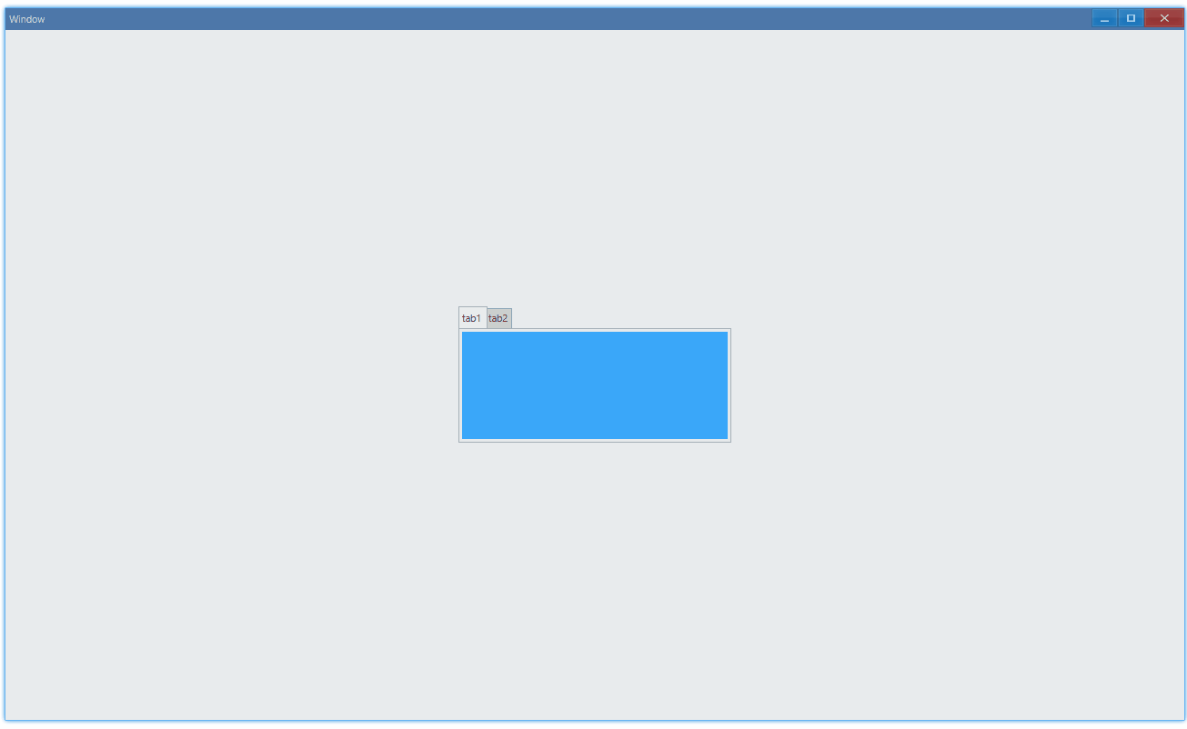
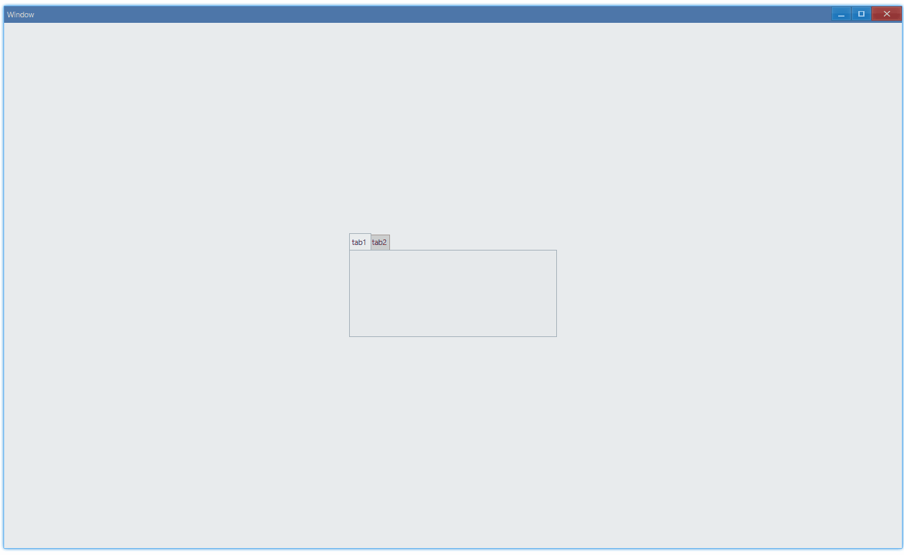
Basic#
export function App() { return ( <Window> <DemoLayout width="300dpx" height="150dpx"> <Tab items={[ { id: 1, name: 'tab1' }, { id: 2, name: 'tab2' }, ]} ></Tab> </DemoLayout> </Window> );}Switch between tab1 and tab2:
API#
export interface ITabComponentProps extends IComponentProps {    items: ITabItem[];}
export interface ITabItem { // 0 is reserved, don't use it as your tab id id: number; // title of tab name: string;}Set Content#
We should put grid in tab as root content:
export function App() { return ( <Window> <DemoLayout width="300dpx" height="150dpx"> <Tab items={[ { id: 1, name: 'tab1' }, { id: 2, name: 'tab2' }, ]} > <Grid style={{ backgroundColor: new Vec4(0, 146, 255, 255 * 0.75), }} ></Grid> <Grid style={{ backgroundColor: new Vec4(238, 39, 70, 255) }} ></Grid> </Tab> </DemoLayout> </Window> );}Usage: