Button
Examples#
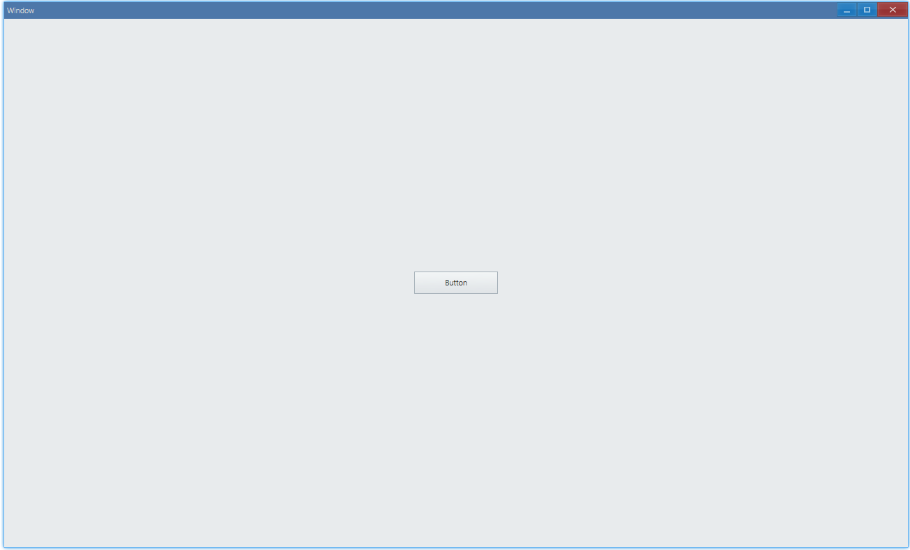
Set Text#
export function App() {    return (        <Window>            <DemoLayout>                <Button text="Button"></Button>            </DemoLayout>        </Window>    );}
// boilerplate code: place control at the center of windowinterface IDemoLayoutProps {    children?: any[] | any;    width?: string;    height?: string;}
function DemoLayout(props: IDemoLayoutProps) {    const width = props?.width ?? '120dpx';    const height = props?.height ?? '32dpx';
const demoLayout = { columns: `1 ${width} 1`, rows: `1 ${height} 1`, areas: { center: { row: 1, column: 1 }, }, }; return ( <Grid style={{ layout: demoLayout }}> <Grid style={{ area: demoLayout.areas.center }}> {props.children} </Grid> </Grid> );}:) Button with text "Button":
API#
export interface IButtonComponentProps extends IComponentProps { text?: string; ...}Text Color#
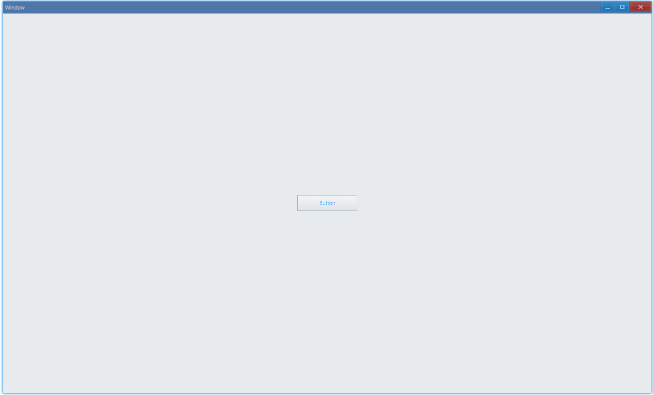
export function App() { return ( <Window> <DemoLayout> <Button text="Button" style={{ color: new Vec4(0, 146, 255, 255 * 0.75) }} ></Button> </DemoLayout> </Window> );}Light blue button text:
API#
export interface IButtonComponentProps extends IComponentProps {  style?: IButtonStyle;  ...}
export interface IButtonStyle extends IComponentStyle { color?: Vec4; ...}Button Visual Style#
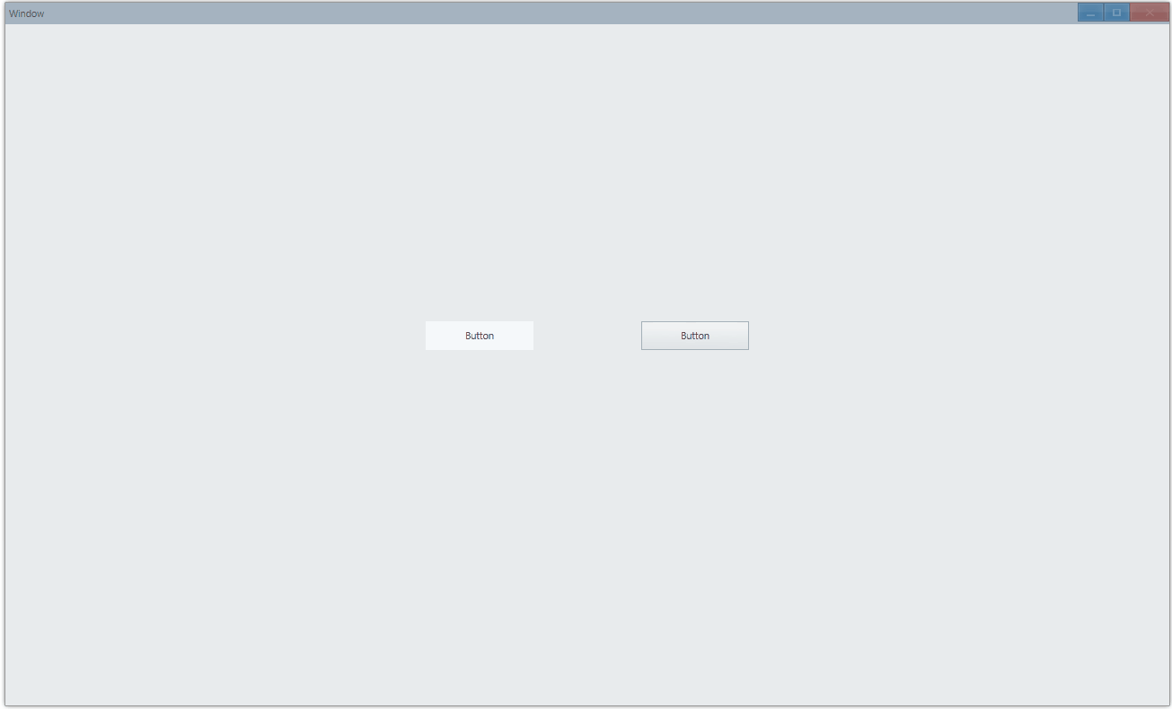
export function App() { return ( <Window> <DemoLayout> <Button text="Button" style={{ visualStyle: ButtonStyle.Command }} ></Button> <Button text="Button" style={{ visualStyle: ButtonStyle.Push }} ></Button> </DemoLayout> </Window> );}- ButtonStyle.Command: no depth effect, just plain button
- ButtonStyle.Push: likes real button, with feedback of depth effect when you press it
API#
export interface IButtonStyle extends IComponentStyle {  visualStyle?: ButtonStyle;  ...}
export enum ButtonStyle { Push, Command,}Click Event#
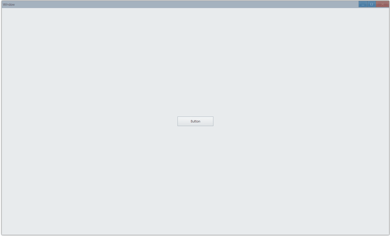
export function App() {    const [text, setText] = useState('Button');
return ( <Window> <DemoLayout> <Button text={text} onClick={() => setText('Button Clicked')} ></Button> </DemoLayout> </Window> );}Click and set text:
API#
export interface IButtonComponentProps extends IComponentProps { onClick?: Parameters<IButton["OnClick"]>[0];}Button Icon#
import { iconResource } from './icon-resource';
function onInit(app: App) {    const context = getAppContext();    context.setIconResource(iconResource as unknown as IIconResource);}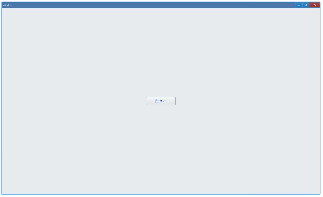
export function App() { return ( <Window onInit={onInit}> <DemoLayout> <Button text="Open" iconInfo={{ name: 'open-file', size: 16 }} ></Button> </DemoLayout> </Window> );}icon-resource.ts
const iconResource = {    size: [16],    path: {        'open-file': [assetsPath('open-file#0.png')],    },} as const;
export { iconResource };
export type IconResourceMapType = Record< keyof typeof iconResource.path, number>;You can add icon alongside text:
API#
export interface IButtonComponentProps extends IComponentProps { iconInfo?: { name: string; size?: number; }; ...}