Label
Examples#
Set Text#
export function App() { return ( <Window> <DemoLayout> <Grid style={{ backgroundColor: new Vec4(0, 146, 255, 255 * 0.75), }} > <Label text="Label"></Label> </Grid> </DemoLayout> </Window> );}Set label text:

As we can see, by default, the label text is aligned to the left.
API#
export interface ILabelComponentProps extends IComponentProps { text?: string;}Background Color#
export function App() { return ( <Window> <DemoLayout> <Label text="Label" style={{ backgroundColor: new Vec4(0, 146, 255, 255 * 0.75), }} ></Label> </DemoLayout> </Window> );}API#
export interface ILabelComponentProps extends IComponentProps {    style?: ILabelStyle;}
export interface ILabelStyle extends IComponentStyle { backgroundColor?: Vec4;}Alignment#
export function App() {    const backgroundColor = new Vec4(0, 146, 255, 255 * 0.75);    return (        <Window>            <DemoLayout>                <Label                    text="Label"                    style={{ backgroundColor, horizontalAlign: AlignType.Near }}                ></Label>                <Label                    text="Label"                    style={{                        backgroundColor,                        horizontalAlign: AlignType.Center,                    }}                ></Label>                <Label                    text="Label"                    style={{ backgroundColor, horizontalAlign: AlignType.Far }}                ></Label>            </DemoLayout>        </Window>    );}
interface IDemoLayoutProps {    children?: any[] | any;    width?: string;    height?: string;}
function DemoLayout(props: IDemoLayoutProps) {    const width = props?.width ?? '120dpx';    const height = props?.height ?? '32dpx';
    const demoLayout = {        columns: `1 ${width} ${width} ${width} ${width} ${width} 1`,        rows: `1 ${height} 1`,        areas: {            left: { row: 1, column: 1 },            middle: { row: 1, column: 3 },            right: { row: 1, column: 5 },        },    };    const [left, middle, right] = props.children;
return ( <Grid style={{ layout: demoLayout }}> <Grid style={{ area: demoLayout.areas.left }}>{left}</Grid> <Grid style={{ area: demoLayout.areas.middle }}>{middle}</Grid> <Grid style={{ area: demoLayout.areas.right }}>{right}</Grid> </Grid> );}There are 3 ways to align text:
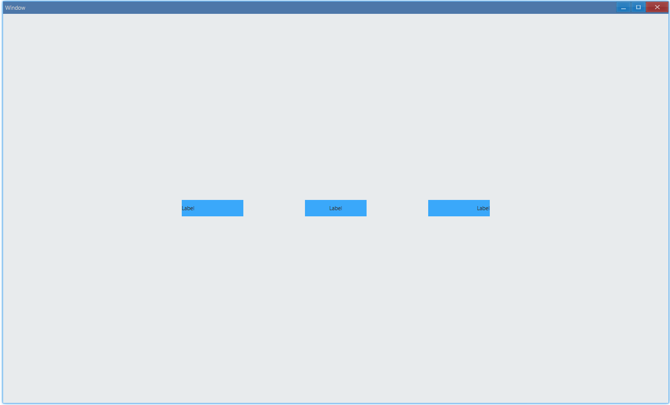
AlignType.Center: align centerAlignType.Near: align left in LTR writing systems, such as English/ChineseAlignType.Far: align right (LTR)
API#
export interface ILabelStyle extends IComponentStyle { horizontalAlign?: AlignType;}Text Color#
export function App() { return ( <Window> <DemoLayout> <Label text="Label" style={{ horizontalAlign: AlignType.Center, backgroundColor: new Vec4(0, 146, 255, 255 * 0.75), color: new Vec4(255, 255, 255, 255), }} ></Label> </DemoLayout> </Window> );}Set text color:

API#
export interface ILabelStyle extends IComponentStyle { color?: Vec4;}