Custom Component
Examples#
Basic#
You can create your own component using Placeholder Component:
export function main(window: Window) { const placeholder = new Placeholder(window); placeholder.OnPaintPost((sender, painter, rect) => { painter.SetPenColor(new Vec4(255, 0, 0, 255)); painter.DrawRectangle(0, 0, rect.w, rect.h); }); const container = getControlDemoContainer(window, 1, 500, 500); container.ControlAdd(placeholder).SetGrid(1, 1); window.SetContent(container);}This gives us a red rectangle:

Custom UI is achieved by painter API, which is similar to canvas API.
API#
export interface IControl extends IControlExtension {    OnPaintPost(        fn: (sender: IControl, painter: IPainter, rect: Rect) => void,    ): IControl;}
export interface IPainter { SetPenColor(vColor: Vec4): void; DrawRectangle(x: number, y: number, w: number, h: number): void;}Custom Button#
This example shows how to listen to event, and finally get this custom button:
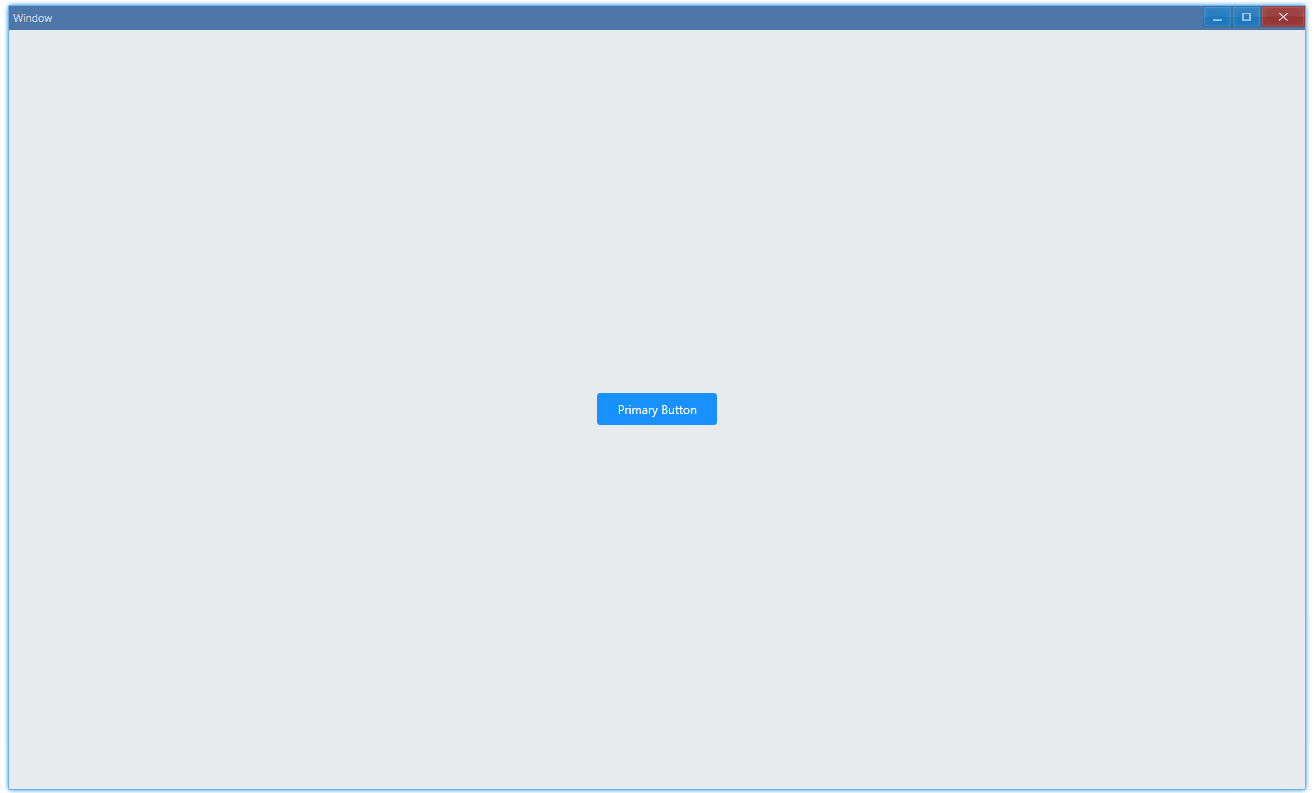
Usage:
export function main(window: Window) { const button = new Button(window, 'Primary Button'); const container = getControlDemoContainer(window, 1, 120, 32); container.ControlAdd(button.control).SetGrid(1, 1); window.SetContent(container);}UI#
A button is just a rectangle with text:
class Button {    text: string;    placeholder: Placeholder;    font: Byo2Font;    style: IButtonStyle;    colors: { normal: Vec4; active: Vec4; hover: Vec4 };    isEntered: boolean;    isPressed: boolean;
    ...
onPaint(sender: IPlaceholder, painter: IPainter, rect: Rect) { const { border, color, backgroundColor } = this.style; painter.SetFillColor(backgroundColor); painter.FillRoundedRectangle(rect.x, rect.y, rect.w, rect.h, border.radius, border.radius); painter.SetTextColor(color); painter.DrawString(this.font, rect, this.text, DrawTextFlag.Center | DrawTextFlag.VCenter, this.text.length); }}Event#
Enter & Leave, Press & Release:
class Button {    ...    constructor(window: Window, text: string) {        ...        this.placeholder = new Placeholder(window);        this.placeholder.OnPaintPost(this.onPaint.bind(this));        this.placeholder.OnPointerEnter(this.onEnter.bind(this));        this.placeholder.OnPointerLeave(this.onLeave.bind(this));        this.placeholder.OnPointerPress(this.onPress.bind(this));        this.placeholder.OnPointerRelease(this.onRelease.bind(this));        ...        this.isEntered = false;        this.isPressed = false;    }
    onEnter() {        this.isEntered = true;        this.style.backgroundColor = this.colors.hover;        this.placeholder.Redraw();    }
    onPress() {        this.isPressed = true;        this.style.backgroundColor = this.colors.active;        this.placeholder.Redraw();    }
    onRelease() {        this.isPressed = false;        this.style.backgroundColor = this.colors.normal;        this.placeholder.Redraw();    }
onLeave() { this.isEntered = false; if (!this.isPressed) { this.style.backgroundColor = this.colors.normal; } this.placeholder.Redraw(); }}Style#
Yes, fully customizable:
class Button {    ...    constructor(window: Window, text: string) {        this.text = text;
        ...
        this.colors = {            normal: new Vec4(24, 144, 255, 255),            hover: new Vec4(64, 169, 255, 255),            active: new Vec4(9, 109, 217, 255),        };
        this.style = {            border: {                radius: 3,            },            color: new Vec4(255, 255, 255, 255),            backgroundColor: this.colors.normal,            font: {                size: 9,                family: ["Segoe UI", "Microsoft YaHei UI", "Meiryo UI", "SimSun-ExtB"],            },        };
const fontDesc = new FontDescription(); fontDesc.Name = this.style.font.family; fontDesc.Size = this.style.font.size; const font = new Byo2Font(window, fontDesc); this.font = font; } ...}API#
export interface IControl extends IControlExtension {    OnPointerEnter(        fn: (sender: IControl, mp: MessagePointer) => void,    ): IControl;    OnPointerLeave(        fn: (sender: IControl, mp: MessagePointer) => void,    ): IControl;    OnPointerPress(        fn: (sender: IControl, mp: MessagePointer) => void,    ): IControl;    OnPointerRelease(        fn: (sender: IControl, mp: MessagePointer) => void,    ): IControl;}
export interface IPainter {    SetFillColor(vColor: Vec4): void;    FillRoundedRectangle(        x: number,        y: number,        w: number,        h: number,        rx: number,        ry: number,    ): void;
    SetTextColor(vColor: Vec4): void;    DrawString(        pFont: Byo2Font,        rc: Rect,        s: string,        nFlag: DrawTextFlag,        nCharCount: number,    ): Rect;}